The Math Behind COVID Variant Dominance
It has been a while since the pandemic, but I would like to show you some interesting math behind the spread of the different COVID variants. During the pandemic one thing that everybody knew was that the future was unpredictable: At any point cases could go up, new measures needed to be taken, and new variants popped up all of the time. However, there is one thing that was surprisingly predictable, namely the spread of these variants. Or at least, the spread relative to the already existing variants. Epidemiologists could predict the moment at which a variant would become dominant often weeks before it happens. The question of course is: How did they do that?
A Very Basic Model
Let’s start with a very simple model. Let’s assume that we have an infinite population of people and that every person infects some number of people every time unit, which we call $\beta$, and that noby recovers from an infection. We can write this model as a differential equation. If there are currently $I$ people infected, then the rate of new infections per time unit should be $\beta I$.
\[\frac{dI}{dt} = \beta I\]We have a solution to this equation. If there are currently $I(0)$ people infected, then after $t$ time steps there will be $I(0) e^{\beta t}$ people infected. Since the later model will not be as easy to solve, let’s also simulate this in code:
import matplotlib.pyplot as plt

dt = 0.01
beta = 1.0
i = 1.0
steps = 1000

history = []
for _ in range(steps):
    history.append(i)
    i += i * beta * dt

plt.stackplot([t * dt for t in range(steps)], history)
plt.show()
This produces the following graph:
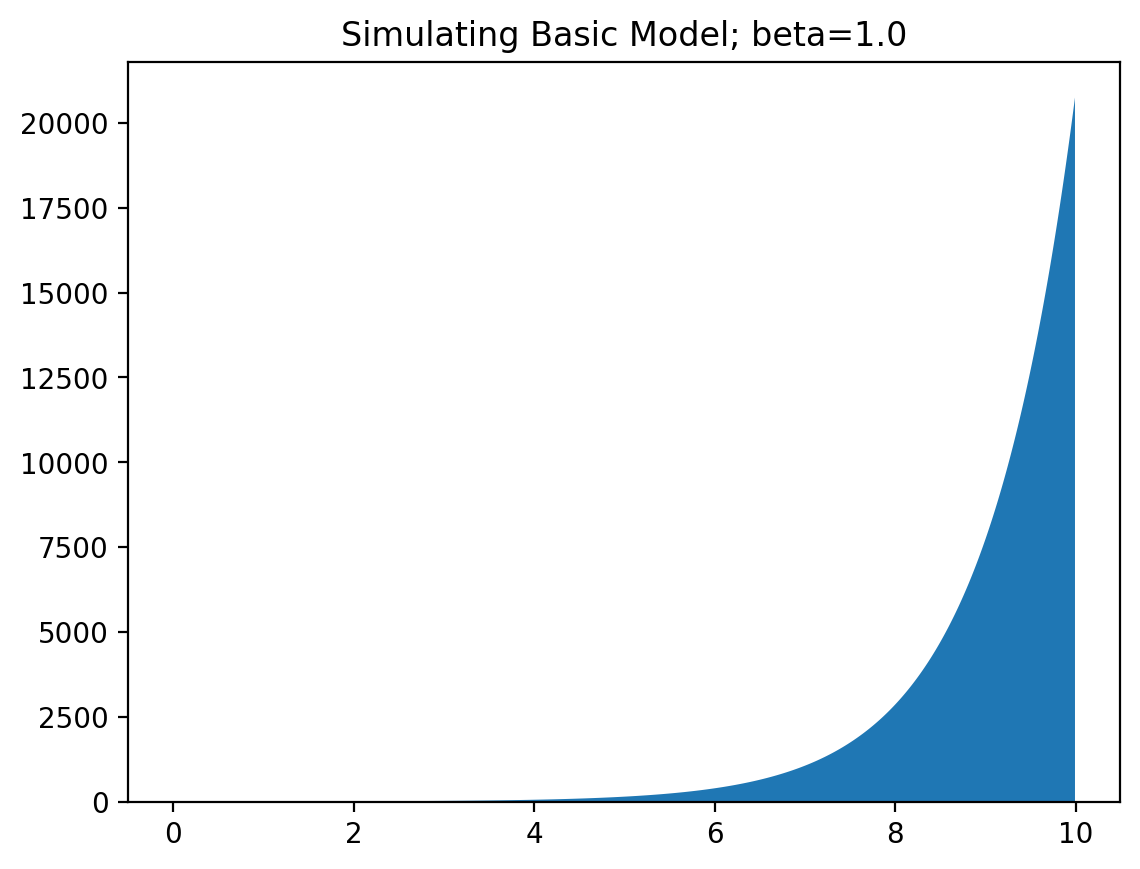
Yep, that seems like an exponential graph alright! A positive value of $\beta$ corresponds with an increase in infections, and a negative value with a decrease. When social distancing measures are taken, this value of $\beta$ decreases with some constant amount (depending on the measure). You can see why it is very important for this value of $\beta$ to remain negative, to get the spread of the virus under control!
Two Variants
Now let’s add another virus variant, which spreads at some different speed $\beta_2$. Now we have two differential equations:
\[\begin{aligned} \frac{dI_1}{dt} &= \beta_1 I_1 \\ \frac{dI_2}{dt} &= \beta_2 I_2 \end{aligned}\]Now let’s simulate that for two different infection rates.
dt = 0.01
beta = 0.3, 0.5
i = 1.0, 0.01
steps = 2500

history = [[], []]
for _ in range(steps):
    history[0].append(i[0])
    history[1].append(i[1])
    i = i[0] + beta[0] * i[0] * dt, i[1] + beta[1] * i[1] * dt

plt.title(f"Variant dominance; beta={beta}")
plt.stackplot([t * dt for t in range(steps)], history)
plt.show()
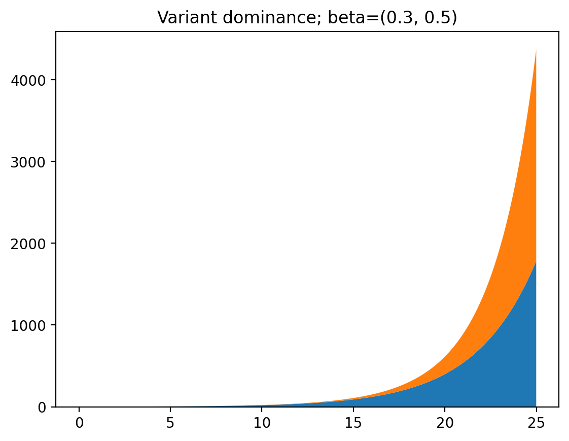
As you can see, at first the first variant is dominant, because it started out with a larger infected population. But after a while the second variant consists of most of the cases because of its larger infection rate. If we change the code a tiny bit we can get the ratio of infections between the two variants to make this clearer:

Now, let’s say there are some measures put into place, so both $\beta_1$ and $\beta_2$ decrease by $0.4$. Note that this means that the cases of the first variant will decrease, while the cases of the second will increase. Let’s take a look at the graph.
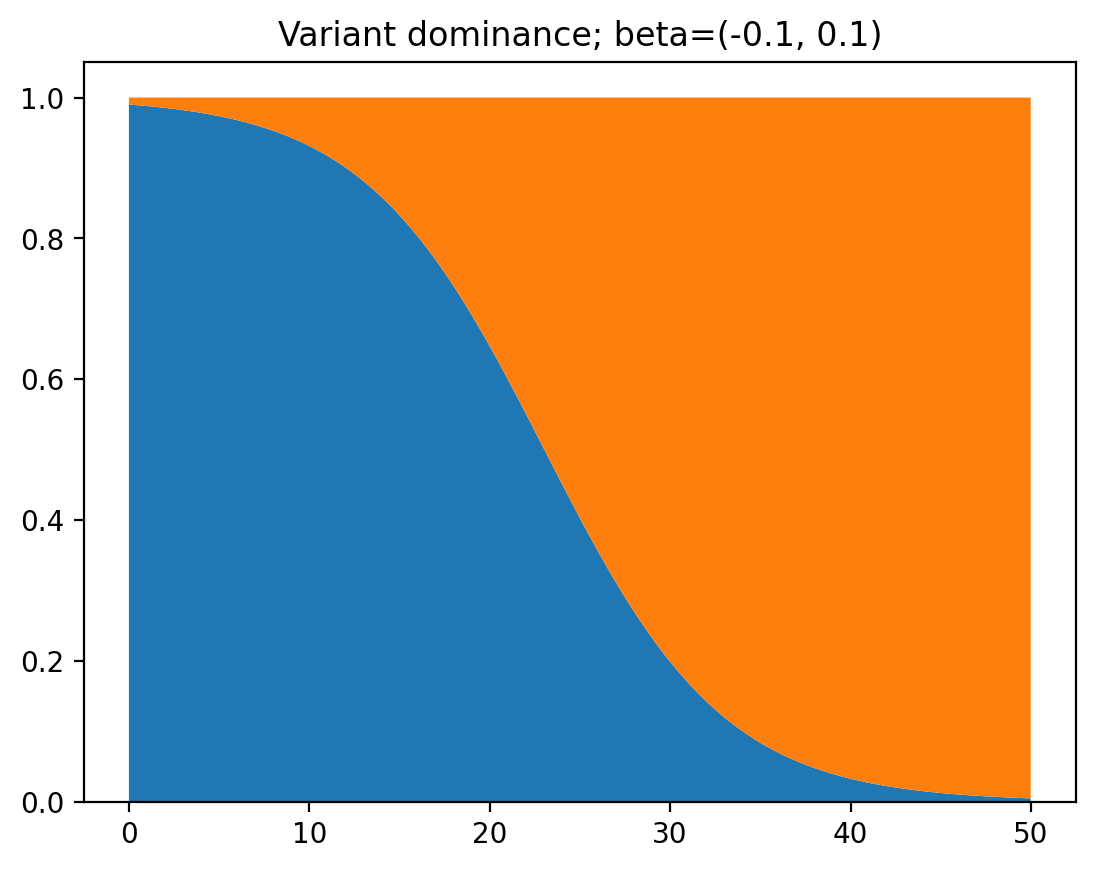
Wait a minute… It’s exactly the same! Why is this happening? Let’s look at the math. First we have the following formula for the ratio between the numbers of cases of the two variants:
\[\frac{I_1(0)e^{\beta_1 t}}{I_2(0)e^{\beta_2 t}}\]This uses the formula of the solution of the differential equation we established earlier. Now let’s look at the variant where $beta_1$ and $\beta_2$ are decreased by some constant amount $\delta$:
\[\frac{I_1(0)e^{(\beta_1 - \delta)t}}{I_2(0)e^{(\beta_2 - \delta)t}} = \frac{I_1(0)e^{\beta_1 t}e^{-\delta t}}{I_2(0)e^{\beta_2 t}e^{-\delta t}} = \frac{I_1(0)e^{\beta_1 t}}{I_2(0)e^{\beta_2 t}}\]The formulas are exactly the same as well. Hence the speed at which a new variant dominates does not depend on any measures taken or variations in spread that are the same for both variants. This is why it is possible to predict the dominance of a variant so accurately!
Immunity
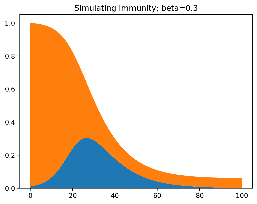
There is a pretty significant detail that we skipped over here: Immunity. For this we can use the SIR model, which stands for Susceptible, Infected, and Removed. As the number of susceptible people shrinks, so does the chance of the virus spreading from one person to another. We can model this as a system of two differential equations, with $\beta$ being the infection rate, and $\gamma$ being the recovery rate (the speed at which people recover from being infected.
\[\begin{aligned} \frac{dS}{dt} &= -\beta IS \\ \frac{dI}{dt} &= \beta IS - \gamma I \end{aligned}\]For simplicity we set the size of the total population to $1$. The code below simulates the SIR model.
dt = 0.01
beta = 0.3
gamma = 0.1
s = 0.99
i = 0.01
steps = 10000

history = [[], []]
for _ in range(steps):
    history[0].append(i)
    history[1].append(s)
    s += -beta * i * s * dt
    i += (beta * i * s - gamma * i) * dt

plt.title(f"Simulating Immunity; beta={beta}")
plt.stackplot([t * dt for t in range(steps)], history)
plt.show()
This produces a plot that shows how most of the population gets infected and recovers, and a small part of the population remains susceptible (has never been infected). The closer $\beta$ is to zero, the larger the group of people that never get infected.
This was for one variant, so let’s try two of them. Then we get a system of three differential equations.
\[\begin{aligned} \frac{dS}{dt} &= -\beta_1 I_1 S - \beta_2 I_2 S \\ \frac{dI_1}{dt} &= \beta_1 I_1 S - \gamma I_1 \\ \frac{dI_2}{dt} &= \beta_2 I_2 S - \gamma I_2 \\ \end{aligned}\]Adapting the Python code and plotting the result:
dt = 0.01
beta = 0.1, 0.8
gamma = 0.1
i = [0.2, 0.00001]
s = 1.0 - i[0] - i[1]
steps = 5000

history = [[], []]
for _ in range(steps):
    s += (-beta[0] * i[0] * s - beta[1] * i[1] * s) * dt
    i[0] += (beta[0] * i[0] * s - gamma * i[0]) * dt
    i[1] += (beta[1] * i[1] * s - gamma * i[1]) * dt
    history[0].append(i[0] / (i[0] + i[1]))
    history[1].append(i[1] / (i[0] + i[1]))

plt.title(f"Variants with immunity; beta={beta}")
plt.stackplot([t * dt for t in range(len(history[0]))], history)
plt.show()
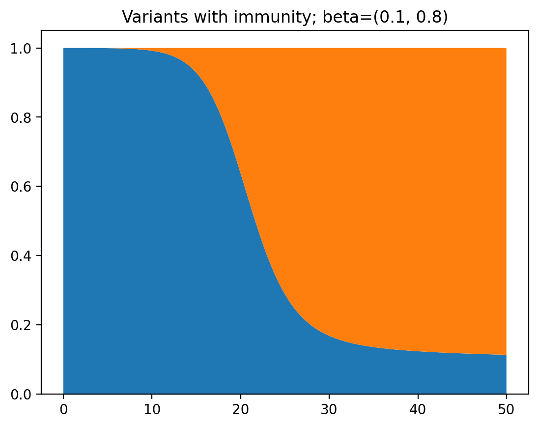
This time, it takes a lot longer for the second variant to dominate, because a large part of the population has already been infected before. However, far in the future is will still fully dominate.
Two variants without cross-immunity
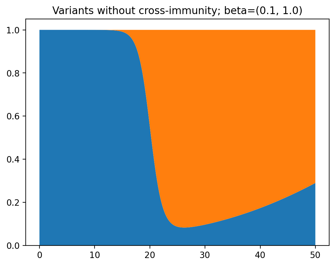
Lastly, let’s look at the spread of two variants when being infected with one variant does not give you immunity against the other.
\[\begin{aligned} \frac{dS_1}{dt} &= -\beta_1 I_1 S_1 \\ \frac{dS_2}{dt} &= -\beta_2 I_2 S_2 \\ \frac{dI_1}{dt} &= \beta_1 I_1 S_1 - \gamma I_1 \\ \frac{dI_2}{dt} &= \beta_2 I_2 S_2 - \gamma I_2 \\ \end{aligned}\]This produces a very interesting graph, where one variant starts to dominate, and then the other dominates again:
It becomes a bit more clear why this is happening when we view this as a graph of total infections instead of relative occurrence of the two variants:
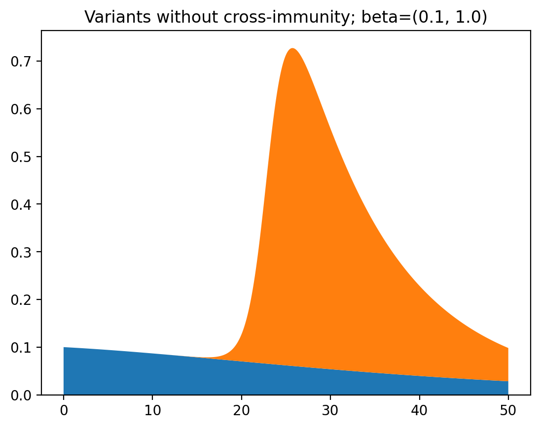
While one of the variants slowly fizzles out, the other rapidly spreads and then rapidly disappears again. This is what cases the increase and then decrease of dominance of the second variant. Pretty interesting!
Conclusion
In the end you should remember that what I showed you here are just toy models. Reality is complicated and the models epidemiologists use to simulate the spread of viruses are much more sophisticated that a couple of lines of code in Python. Still, it is pretty interesting to see what happens when you play around with the math.
If you want to look at all of the code, I’ve uploaded a notebook on GitHub